- BASEBALL AWARDS
- 2026 AWARDS
- 5 STAR BASEBALL RINGS
- BASEBALL ALL-STAR AWARDS
- BASEBALL BALL RINGS
- BASEBALL BATTER RING
- BASEBALL BELTS
- BASEBALL BRACELETS
- COLORED BASEBALL RINGS
- CUSTOMIZABLE BASEBALL AWARDS
- DELUXE BASEBALL RINGS
- DIAMOND SERIES BASEBALL RINGS
- DISTRICT BASEBALL RINGS
- HOME PLATE BASEBALL RINGS
- HOME RUN DERBY RINGS
- BASEBALL TURNOVER CHAINS
- JUMBO BASEBALL RINGS
- BASEBALL LEAGUE RINGS
- BASEBALL MEDALS
- BASEBALL MVP AWARDS
- BASEBALL NECKLACES
- BASEBALL PARTICIPATION AWARDS
- BASEBALL PLACEMENT AWARDS
- PONY BASEBALL AWARDS
- SEASONAL
- BASEBALL SLUGGER RING
- BASEBALL SPINNER RINGS
- BASEBALL STATE RINGS
- SQUARE BASEBALL RINGS
- BASEBALL TEAM AWARDS
- T-BALL
- TEXAS RINGS
- BASEBALL WORLD SERIES RINGS
- BASKETBALL AWARDS
- CHEER AWARDS
- FOOTBALL AWARDS
- 5 STAR FOOTBALL RINGS
- FOOTBALL RINGS
- 2026 AWARDS
- CUSTOMIZABLE FOOTBALL AWARDS
- FANTASY FOOTBALL AWARDS
- FOOTBALL ALL-STAR AWARDS
- FLAG FOOTBALL AWARDS
- FOOTBALL BELTS
- FOOTBALL MEDALS
- FOOTBALL MVP AWARDS
- FOOTBALL NECKLACES
- FOOTBALL PARTICIPATION AWARDS
- FOOTBALL PLACEMENT AWARDS
- SEASONAL
- FOOTBALL TURNOVER CHAINS
- SOCCER AWARDS
- SOFTBALL AWARDS
- 2026 AWARDS
- 5 STAR SOFTBALL RINGS
- SOFTBALL ALL STAR RINGS
- CUSTOMIZABLE SOFTBALL AWARDS
- SOFTBALL RINGS
- SOFTBALL BATTER RINGS
- SOFTBALL BELTS
- SOFTBALL BRACELETS
- BIG BANG SOFTBALL RINGS
- COLORED SOFTBALL RINGS
- DELUXE SOFTBALL RINGS
- DIAMOND SERIES SOFTBALL RINGS
- DISTRICT SOFTBALL RINGS
- HOME PLATE SOFTBALL AWARDS
- SOFTBALL HOME RUN DERBY
- JUMBO SOFTBALL RINGS
- SOFTBALL LEAGUE RINGS
- MEDALS
- MVP
- NECKLACES
- SOFTBALL PARTICIPATION AWARDS
- SOFTBALL PLACEMENT AWARDS
- PONY SOFTBALL RINGS
- SEASONAL
- SLUGGER RING
- SOFTBALL SPINNER RINGS
- SQUARE SOFTBALL RINGS
- SOFTBALL TEAM AWARDS
- T-BALL
- TEXAS RINGS
- SOFTBALL TURNOVER CHAINS
- FASA SOFTBALL AWARDS
- SOFTBALL WORLD SERIES RINGS
- USA SOFTBALL AWARDS
- USFA
- VOLLEYBALL AWARDS
- OTHER SPORTS
What Makes a Ring Look “High-End” (Design Elements That Matter)
A ring design looks expensive when every visible detail feels intentional, balanced, polished, and built to last. High-end style is not only about price. It is about proportion, finish, structure, symbolism, and the way each design element works together to create a ring that feels substantial, refined, and memorable. Whether the ring is worn to celebrate a championship, honor a major achievement, recognize a team, or mark a meaningful milestone, the best designs communicate prestige before anyone reads a single word on the piece.
A ring can be bold without looking overwhelming. It can feature stones, lettering, logos, and textures without appearing crowded. The difference between an average-looking ring and one that feels premium often comes down to design discipline. Strong visual hierarchy, clean spacing, quality materials, and carefully selected finishes all help create the impression of a ring that belongs in a display case and on someone’s hand with pride.
Below are the design elements that matter most when creating a ring with a high-end appearance.
Strong Overall Proportion
The first thing people notice about a ring is its overall shape and proportion. A high-end ring usually has a clear sense of balance. The face should be large enough to make an impact, but not so oversized that it looks awkward or difficult to wear. The shoulders, band, top, and side details should feel connected rather than pieced together.
Good proportion creates visual confidence. A ring that is too thin may feel underwhelming, while one that is too bulky can look heavy and poorly planned. The best designs find the right middle ground.
Important proportion details include:
- A face size that suits the purpose of the ring
- Side panels that support the top design without competing with it
- A band thickness that feels durable and comfortable
- Even spacing between stones, lettering, borders, and symbols
- A silhouette that looks impressive from multiple angles
When the proportions are right, the ring immediately feels more valuable.
A Clean, Focused Centerpiece
A premium-looking ring needs a strong focal point. This could be a team logo, championship year, trophy symbol, mascot, number, or another central design feature. The centerpiece should be easy to identify at a glance. If too many elements fight for attention, the ring can look busy instead of high-end.
Luxury design often relies on clarity. The viewer should instantly understand where to look first, then naturally notice the supporting details around it. A clean centerpiece gives the ring authority and helps the design feel organized.
To make a centerpiece look more refined, designers often use:
- Raised metalwork
- Contrasting textures
- Stone accents around the main feature
- Defined borders
- Symmetrical framing
- Clear lettering that does not crowd the main image
The centerpiece should feel important. It should not disappear into the background or get lost among too many decorative elements.
Quality Metal Finish
Metal finish plays a major role in whether a ring looks high-end. A polished finish reflects light and gives the piece a clean, impressive shine. Matte or brushed details can add depth and contrast when used carefully. The most premium-looking rings often combine finishes to create dimension.
For example, a polished border can stand out beautifully against a textured background. Raised lettering can look sharper when placed over a darker recessed area. These contrasts make the ring easier to read and more visually interesting.
Common finishes that contribute to a premium appearance include:
- High-polish surfaces for shine and brightness
- Brushed metal areas for a more refined, understated look
- Antiqued or darkened recesses for contrast
- Textured backgrounds that add depth
- Smooth edges that make the ring feel finished and comfortable
A ring with uneven shine, dull surfaces, or rough edges will usually look less expensive, even if the basic design is strong. Finish quality is one of the clearest signs of craftsmanship.
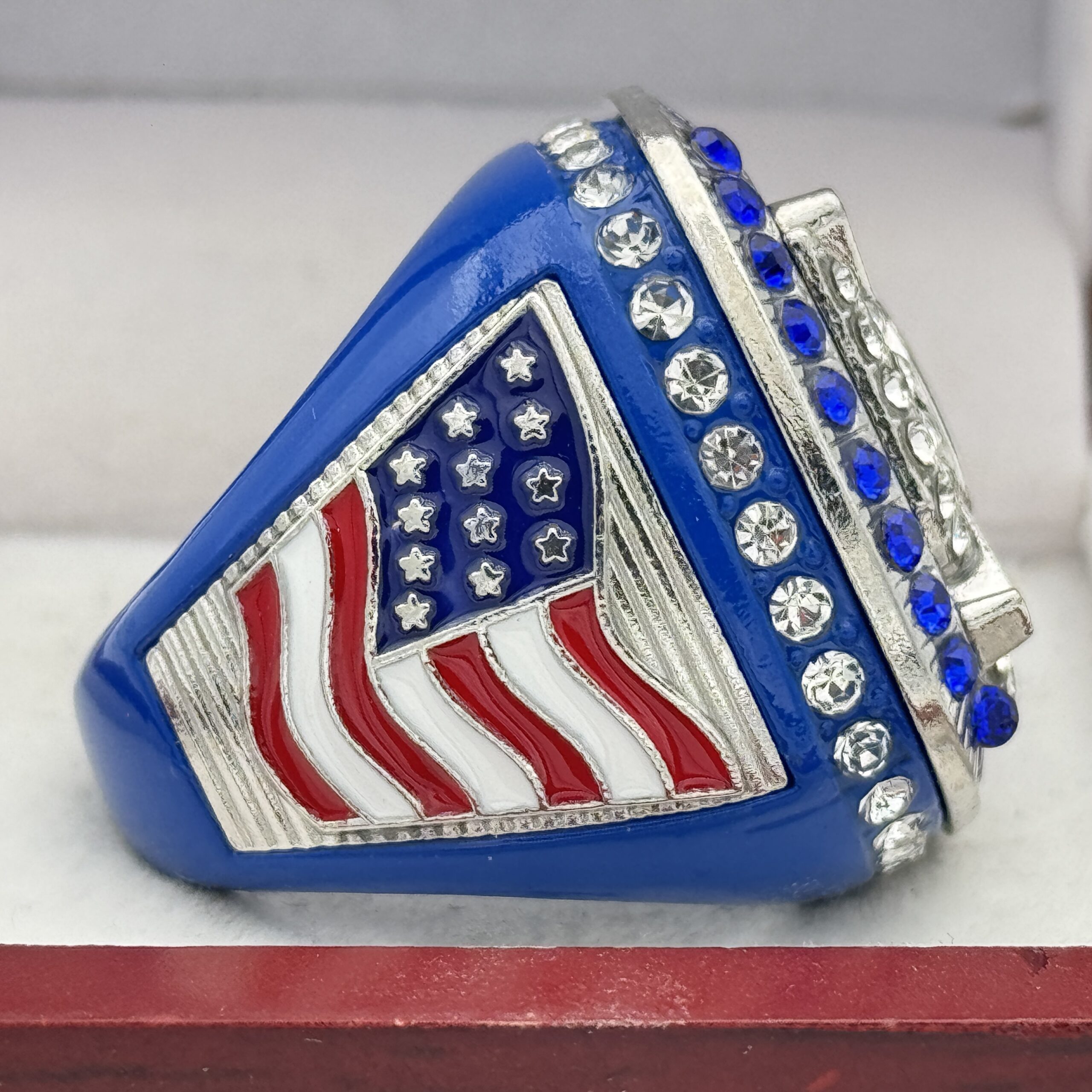
Stone Placement That Enhances the Design
Stones can make a ring look more impressive, but only when they are placed with purpose. Too many stones in the wrong areas can make a design look cluttered. High-end stone placement supports the structure of the ring and draws attention to the most important areas.
Stone accents often work best when they create borders, highlight a central emblem, or add sparkle to specific points of emphasis. The goal is not simply to add as many stones as possible. The goal is to use stones to improve balance, movement, and visual impact.
Effective stone placement may include:
- A halo around the center design
- Stones along the outer edge of the face
- Accent stones on the shoulders
- A single prominent center stone
- Stones arranged symmetrically for a clean look
- Stones used to frame text or logos
The spacing between stones matters as much as the stones themselves. Even alignment and consistent sizing help create a polished, expensive appearance.
Defined Borders and Framing
Borders are one of the most underrated elements of ring design. A well-designed border gives the ring structure. It separates the central design from the outer edge and makes the entire piece look more complete.
Without a border, a ring can feel unfinished or visually loose. With the right border, the design feels contained, intentional, and easier to read. Borders can be simple, decorative, stone-set, raised, textured, or layered.
High-end rings often use borders to:
- Frame the center design
- Add dimension to the face
- Create contrast between sections
- Improve readability
- Make the ring look more substantial
- Guide the eye around the design
A strong border acts almost like a frame around a piece of artwork. It helps the main design feel important and presentation-ready.
Crisp Lettering and Readable Text
Lettering can make or break the appearance of a ring. Even a beautiful ring can look less refined if the text is crowded, uneven, or hard to read. High-end rings use lettering that is clear, properly spaced, and suited to the style of the design.
Block lettering often works well for sports rings because it feels strong and bold. Serif lettering can add a traditional, prestigious feel. Script lettering may work in limited areas, but it should remain readable.
For premium results, lettering should have:
- Consistent spacing
- Clean edges
- Enough room around each word
- Proper alignment
- Strong contrast against the background
- A font style that matches the ring’s purpose
Names, team titles, championship years, and achievement details should be readable without making the ring feel crowded. Less text, placed well, often looks more expensive than too much text squeezed into a small area.
Depth and Dimension
A flat design rarely looks as premium as one with depth. High-end rings usually include multiple layers, raised details, recessed backgrounds, and dimensional elements that catch the light from different angles.
Depth gives the ring presence. Raised logos, beveled edges, and layered borders all create shadows and highlights. This makes the design feel more sculpted and substantial.
Dimensional details may include:
- Raised center logos
- Recessed backgrounds
- Layered side panels
- Beveled borders
- Raised lettering
- Sculpted shoulders
- Textured fields behind smooth metalwork
When a ring has depth, it looks more like a true commemorative piece rather than a flat decoration. Dimension adds drama without needing unnecessary clutter.
Balanced Side Panels
The top of the ring usually receives the most attention, but the side panels are essential to a high-end look. Side panels add storytelling, identity, and visual weight. They can feature names, numbers, years, team symbols, positions, achievements, or decorative elements.
The key is balance. Side panels should support the main design, not distract from it. A ring with blank or poorly designed sides may look incomplete. A ring with overly crowded side panels may feel chaotic.
Strong side panels usually include:
- One main feature per side
- Clean lettering
- Good use of raised and recessed details
- Symmetry between left and right sides
- Icons or numbers that are easy to recognize
- Borders that connect visually with the ring face
A well-designed side panel makes the ring feel complete from every angle. This is especially important for rings that will be photographed, displayed, or worn at ceremonies.
Smart Use of Color
Color can instantly elevate a ring when used thoughtfully. Team colors, school colors, or symbolic tones can create a strong identity and emotional impact. However, too many colors can make a ring look less refined.
High-end color use is usually controlled and purposeful. A primary color may dominate, while one or two supporting colors add contrast. Enamel, stones, and metal tones can all contribute to the color story.
Effective color choices can:
- Reinforce team or organization identity
- Make logos more recognizable
- Add contrast to lettering
- Highlight important design areas
- Create a more memorable look
- Make the ring feel visually connected
The most expensive-looking rings often use color with restraint. Each color should have a reason for being there.
Symmetry and Alignment
Symmetry gives a ring a sense of order. When design elements are aligned properly, the ring feels more professional and polished. Misaligned stones, off-center logos, uneven lettering, or unbalanced side elements can make a ring look cheaper.
Symmetry does not mean every ring must be perfectly identical on both sides. It means the design should feel visually stable. The viewer should not feel like one side is heavier, busier, or more important than the other unless that imbalance is clearly intentional.
Important alignment details include:
- Centered logos
- Even border spacing
- Straight text placement
- Matching side panel weight
- Balanced stone patterns
- Consistent spacing between design sections
A high-end ring looks like every element was placed with care. Alignment is one of the quiet details that people may not consciously notice, but they immediately feel when it is done well.
Meaningful Detail Without Overcrowding
A ring often needs to tell a story. It may represent a season, a team, a title, a victory, or years of effort. Details matter, but too many details can weaken the overall design.
The most refined rings choose meaningful details and give them room to stand out. Instead of packing every possible symbol onto the ring, a high-end design focuses on the strongest visual elements.
Good details may include:
- A championship year
- A team name
- A player number
- A mascot or logo
- A record or achievement
- A trophy icon
- A location or event reference
- A short phrase or motto
Each detail should earn its place. If an element does not improve the design or support the story, it may make the ring look less polished.
Comfortable, Substantial Construction
A ring should look impressive, but it should also feel good to wear. High-end appearance is connected to physical feel. A ring that feels too light, too sharp, or poorly shaped may not create the same sense of value.
Comfort details include smooth inner surfaces, balanced weight, and edges that do not feel rough against the skin. The ring should have enough substance to feel durable without becoming uncomfortable.
A substantial ring often communicates quality through:
- Solid-feeling weight
- Smooth interior finishing
- Rounded edges
- Balanced top and band structure
- Durable metalwork
- Secure stone settings
A premium look should be matched by a premium wearing experience.
Consistency Across the Entire Design
One of the biggest differences between an ordinary ring and a high-end-looking ring is consistency. Every part of the ring should feel like it belongs to the same design. The lettering, borders, colors, stones, side panels, and finish should work together.
Inconsistent styling can make a ring feel visually disconnected. For example, modern block lettering may clash with overly ornate decorative elements. Too many textures can compete with each other. Mixed symbols without a clear hierarchy can confuse the design.
A cohesive ring has:
- A consistent visual theme
- Matching design language across all sides
- Repeated shapes or patterns
- Coordinated finishes
- Compatible fonts
- A clear relationship between color and metal tone
Consistency makes the ring feel complete, intentional, and more expensive.
The Role of Simplicity in High-End Design
Many people assume a more expensive-looking ring must have more decoration. In reality, restraint often creates a more premium appearance. High-end design is about choosing the right details, not adding every possible feature.
Simplicity does not mean plain. It means controlled. A ring can still be bold, sparkling, and highly detailed while maintaining a clean design structure. The key is leaving enough visual space for each element to stand out.
A ring may look more refined when it avoids:
- Crowded text
- Too many competing symbols
- Uneven stone patterns
- Excessive color combinations
- Overly complicated backgrounds
- Poorly matched fonts
- Unclear focal points
A confident design does not need to shout from every angle. It communicates importance through balance, detail, and finish.
FAQ
What makes a ring look expensive?
A ring looks expensive when it has balanced proportions, clean lettering, strong metal finish, well-placed stones, clear symbolism, and detailed craftsmanship. The overall design should feel organized, substantial, and polished.
Do stones automatically make a ring look high-end?
Not always. Stones can add sparkle and prestige, but placement matters. A few well-positioned stones can look more refined than many stones arranged without balance or purpose.
Why is lettering so important on a ring?
Lettering affects readability and overall polish. Crisp, well-spaced text makes the ring look professional, while crowded or uneven lettering can make the design feel less premium.
What metal finish looks the most high-end?
A polished finish often creates a bright, classic look, while brushed, textured, or antiqued details can add depth. The best result often comes from combining finishes in a balanced way.
How much detail should a ring include?
A ring should include enough detail to tell its story without becoming crowded. Important names, dates, logos, numbers, and achievement details should be prioritized over unnecessary decoration.
Are bigger rings always more impressive?
Not necessarily. A larger ring can make a strong statement, but only if the proportions are balanced. A ring that is too large or bulky may look awkward instead of premium.
What role does color play in ring design?
Color helps communicate identity and meaning. Team colors or symbolic colors can make a ring more memorable, but using too many colors can make the design look busy.
How can side panels improve a ring?
Side panels add depth, personalization, and storytelling. They help the ring look complete from every angle and can highlight names, numbers, years, or achievement details.
What is the most important design element?
The most important element is balance. A high-end ring depends on how well the center design, side panels, stones, lettering, metal finish, and proportions work together.
Shop Today
A high-end ring is more than a piece of jewelry. It is a symbol of achievement, pride, teamwork, and lasting recognition. The right design elements can make a ring feel bold, meaningful, and impressive from every angle. From polished finishes and balanced proportions to crisp lettering and well-placed stones, every detail contributes to the final impression.
For championship-style rings, team rings, and recognition pieces that deliver a strong, professional look, shop with us today. Explore ring styles that help celebrate big moments with the quality, presence, and visual impact they deserve.